Engage an Expert to Become One
Facilitating Discovery Workshops to Leverage Your Team's Expertise
This case study includes sensitive material, so the content and data may be limited.
Overview
Getting acclimated to a new industry can be challenging, and it can take a some time to complete the "discovery" process. In an effort to avoid a series of long, overwhelming meetings; I decided to leverage my team by facilitating collaborative workshops. Quickly, I was able to get the ball rolling to redesign a very complex enterprise website. This case study will feature how those early efforts allowed me to quickly focus-in on key areas; then drive progress.
Problem
A complex enterprise website meant to serve as a critical resource to support hundreds of Saas applications had an overwhelming navigation, lacked content hierarchy or page flow. This presented a very strenuous experience for different users to discover critical information; relevant to their unique technical roles.
Goal
Improve website navigation for two core user types, so they can quickly and easily discover critical information across different phases of a complex engineering process.
Outcome
A simple website was delivered that is quick and easier to navigate.
- Content is curated across two unique user journeys, dependent on the user’s chosen role.
- The minimalist interface uses a repeated, standard pattern across the site to display information and resources; making it easy to consume.
- Interacting with a stepper-progress bar will move users through different phases, discovering critical information as needed.
- Usability tests overwhelmingly suggests the new site as lighter and much easier to find valuable role-base resources; in less time.
Role
Lead UX Designer
Deliverables
- Journey Map
- User Flows
- Wireframes
- Prototype
Tool
Figma
Where To Start?
Minutes into my first team meeting I said, “Hold on, let’s pump the brakes”. There is no way I can retain all 10+ years of insight my team was generously feeding me.
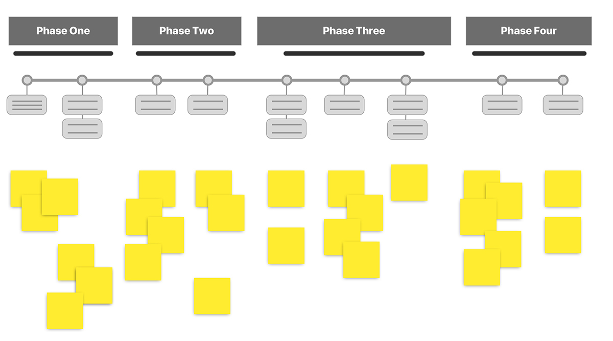
Instead, I offered to host a collaborative workshop. Guiding my team through focussed questions on user outcomes and known friction points; proved to be a more productive exercise and also brought the team closer. We quickly began generating bite-sized “user stories” (how might we’s), posting them along the provided user journeys. This simplified a long, complex journey into several phases; defined by a few key user stories. No need to get crazy… it was just enough to get the wheels greased.
- Leverage my team’s well of expertise in this new industry.
- Identified key scenarios along the user journey to focus on.
- Quickly received buy-in from engaging my team.
- Dramatically accelerated my “Discovery” phase into action items.
User Story patterns help define “MVP”
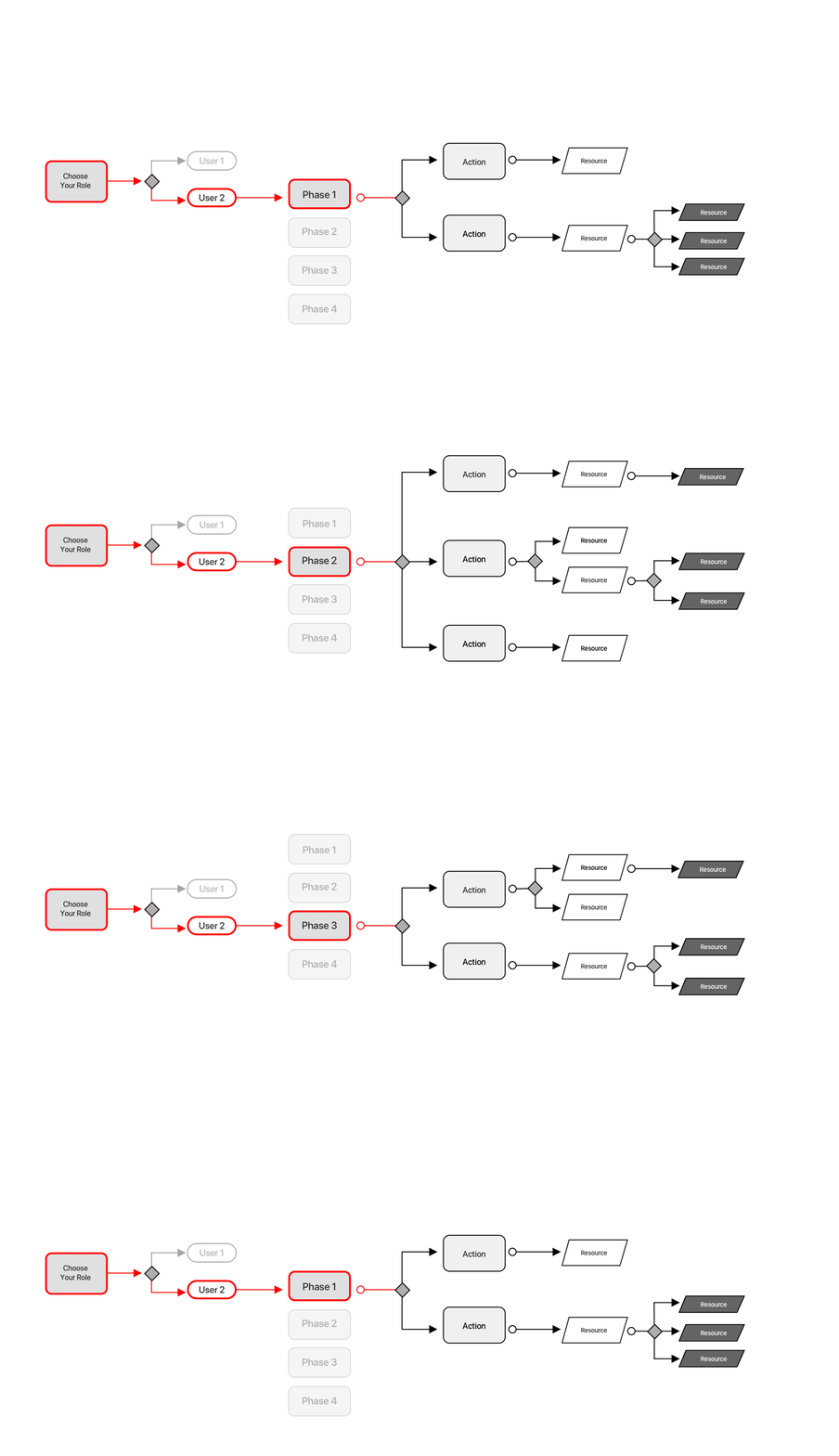
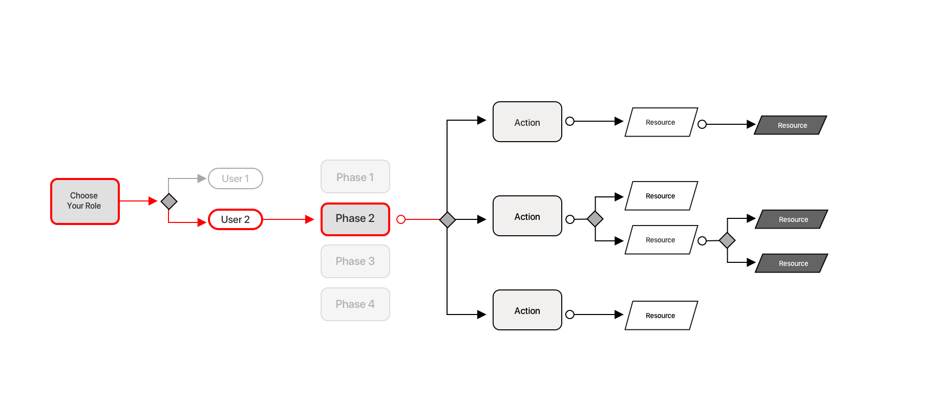
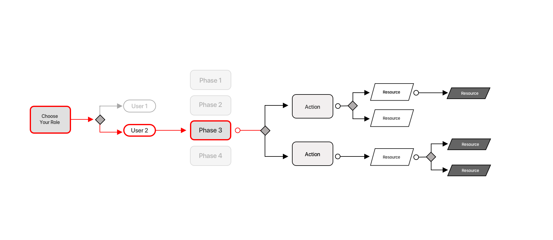
Simplify a Flow
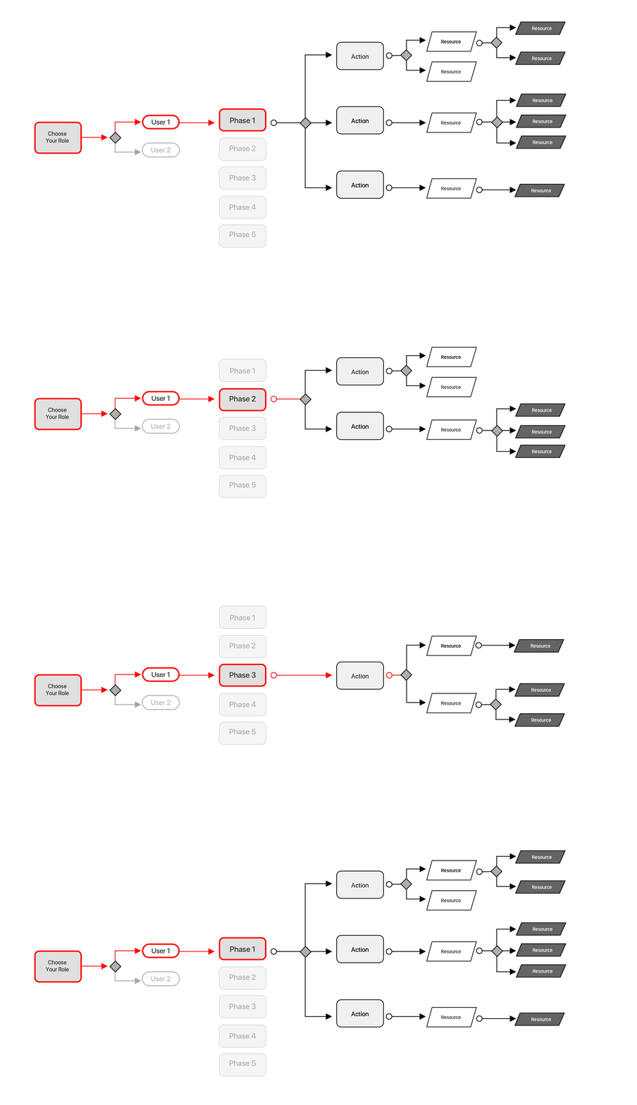
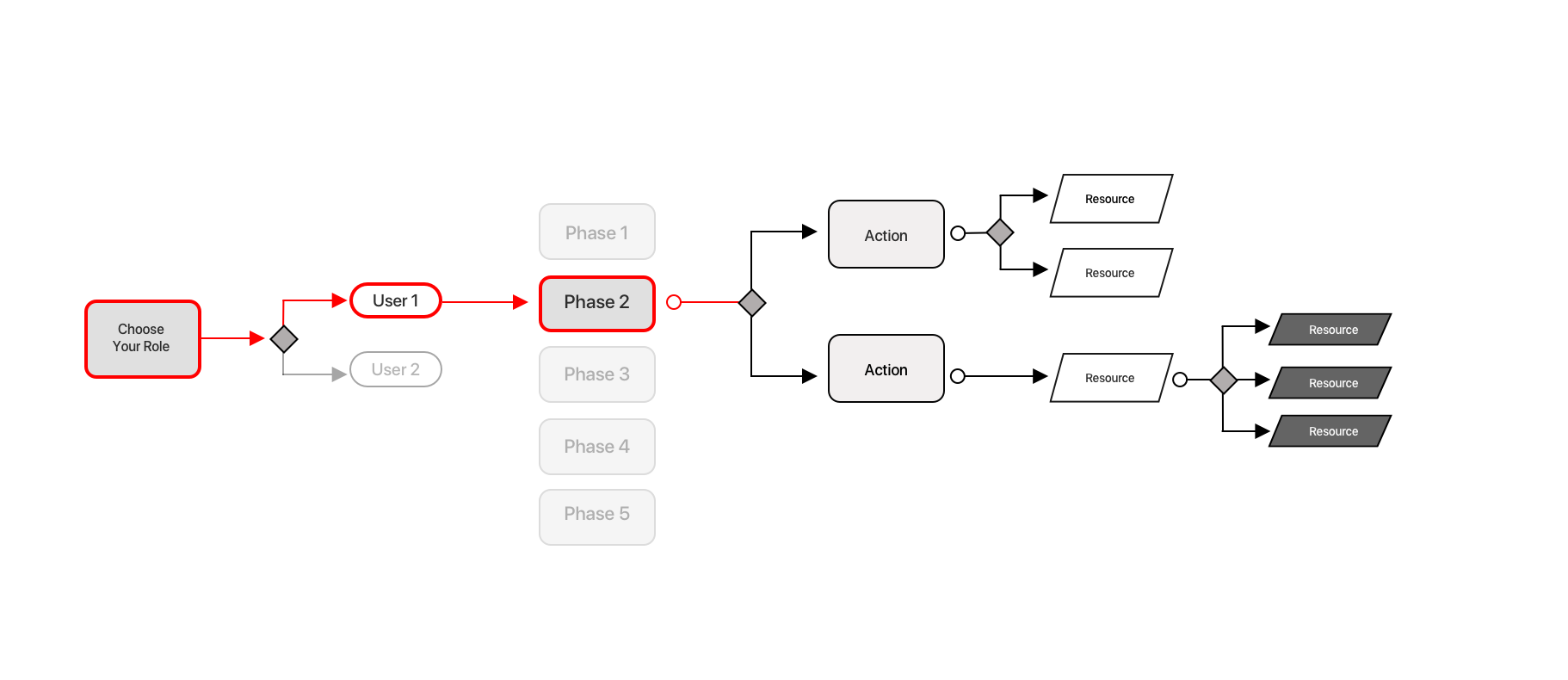
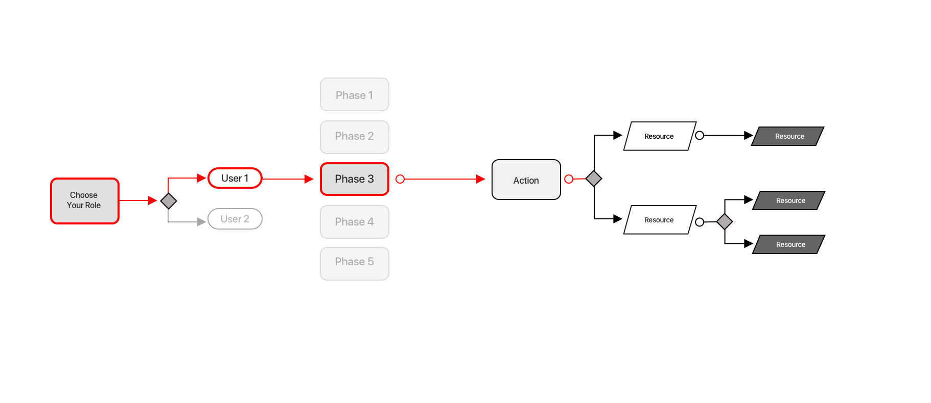
Focussing on several key areas; core user flows were then developed.
Two critical roles given unique user journeys.
Each journey was divided up into smaller phases.
Each phase was curated with the most valuable resources.
Exploring The Design
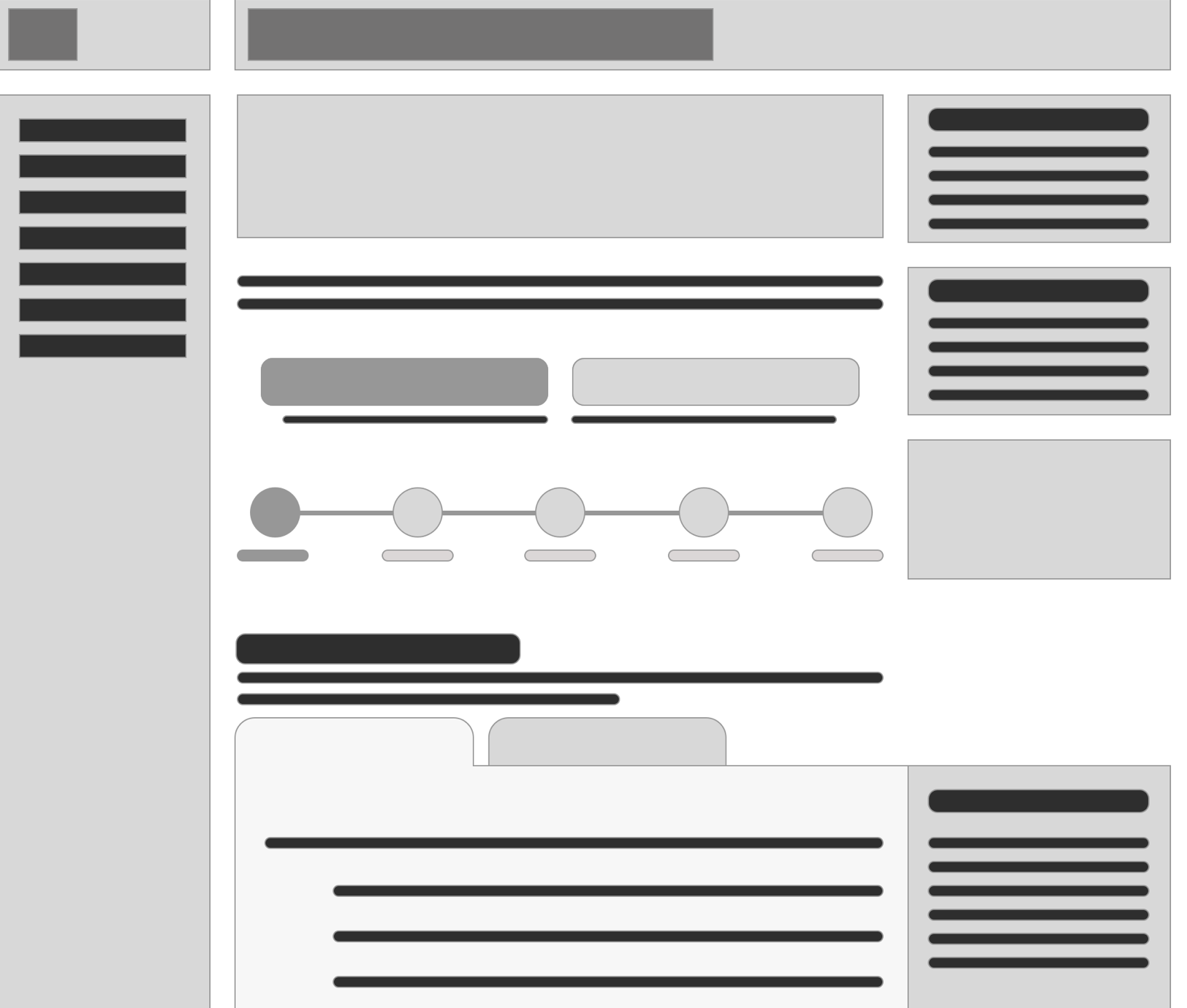
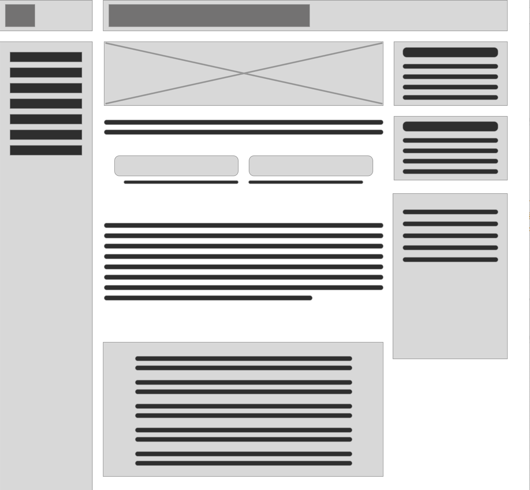
Interactive elements and common patterns were used in an attempt to heuristically engage users and simply a very complex, static Confluence website. The interactive nature was a new solution for this internal Confluence website and should add a layer of fun for this technical audience. All design decisions closely followed the company’s current design system guidelines.
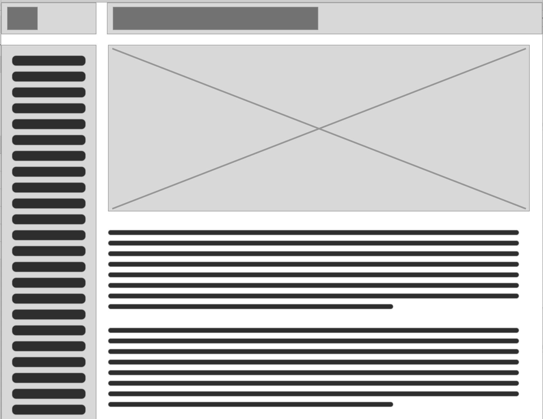
The previous side-navigation deterred users from traditionally using the site via the home page. Updated to an Accordion Menu.
- Reduced cognitive overload
- Organized and collapsed topics w/ ability to scale
- Created much needed white space
Choose your role – user journey buttons
- Unique role-based journeys
- Only see role-specific information and resources
Stepper Progress Bar visuallzed required phases.
- Users easily focus on limited amount of content
- Explore the stepper to set expectations
- Each role has different phases
Tabs organize content to limit visual noise.
- Standard labels repeated through out site
- Allow for versatile content (images, links) while maintaining pattern style
Results Are In
- Incorporated feedback from 12 discovery user interviews.
- Conducted 10 usability tests across global userbase
- All users were pleased with a better experience than before
Final Thoughts
Entering this project, I only knew what I knew about the space…. Not much! Leaning into my team’s knowledge, proved to blaze the path forward to a successful and collaborative redesign.
- Discovered key friction points and critical requirements
- Received specific user insight to launch deeper discovery research
- Specific user stories helped to shape the design goals
The final result was delivering a site that included specific context and proved to be a valuable introduction and resource for thousands of product engineers across the globe. Easy for core-users to quickly gain context of the important journey ahead.
